Pages
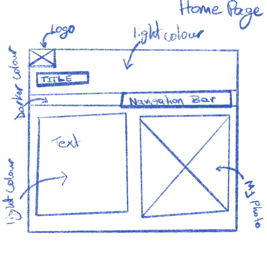
Index page
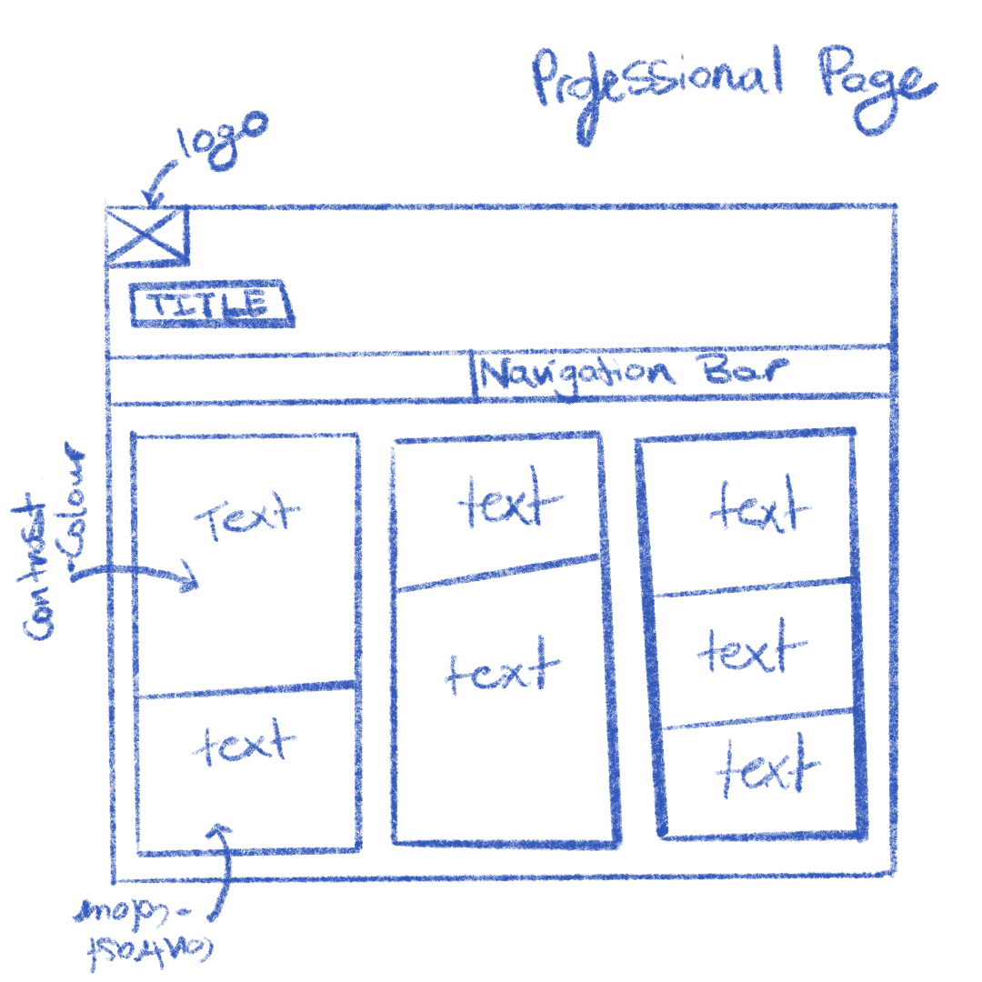
Professional page
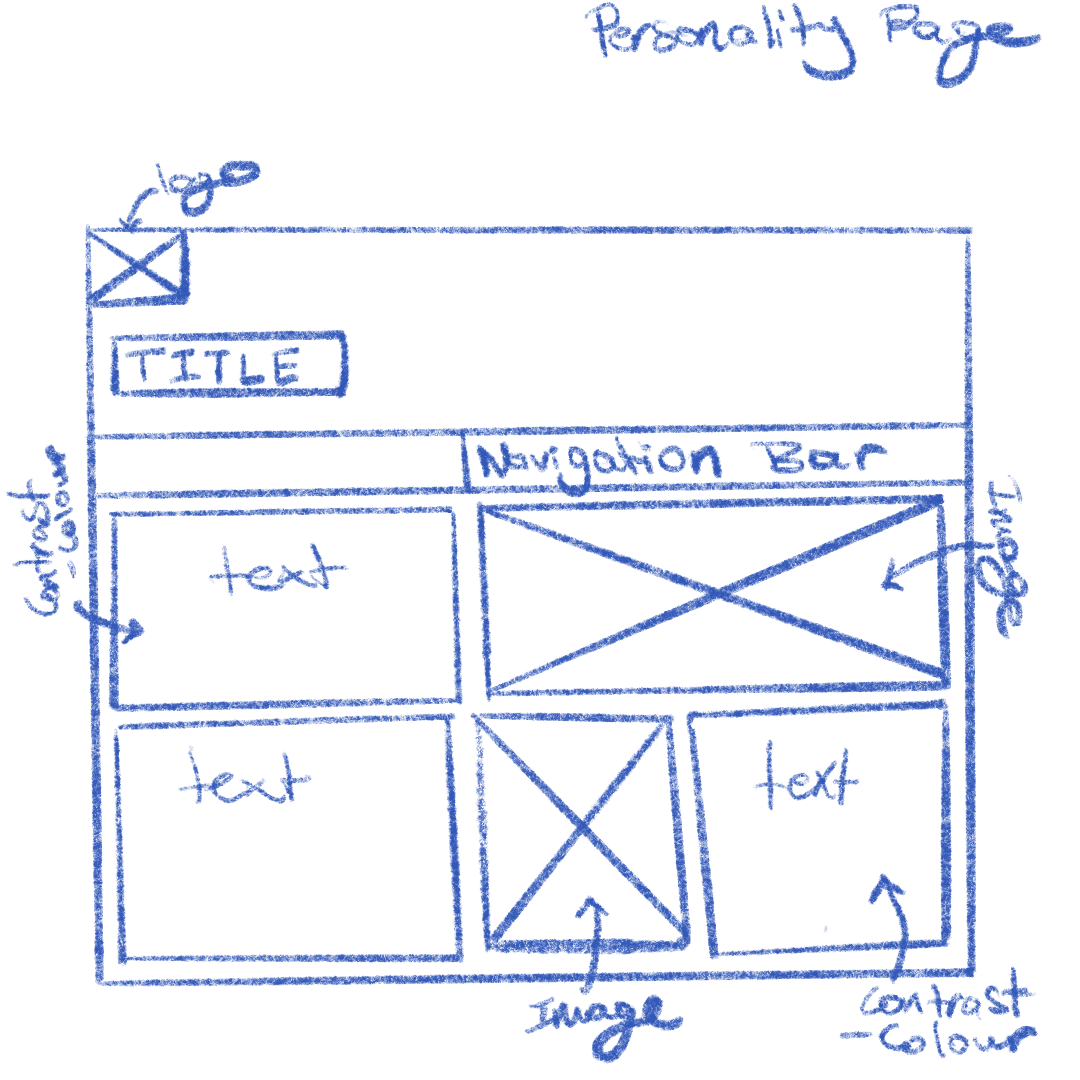
Personality page
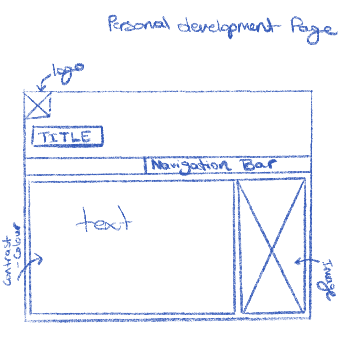
Personal Development page
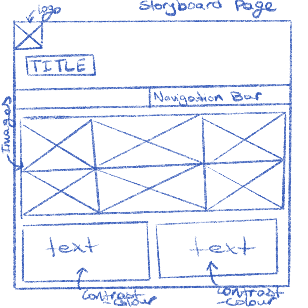
Storyboard page
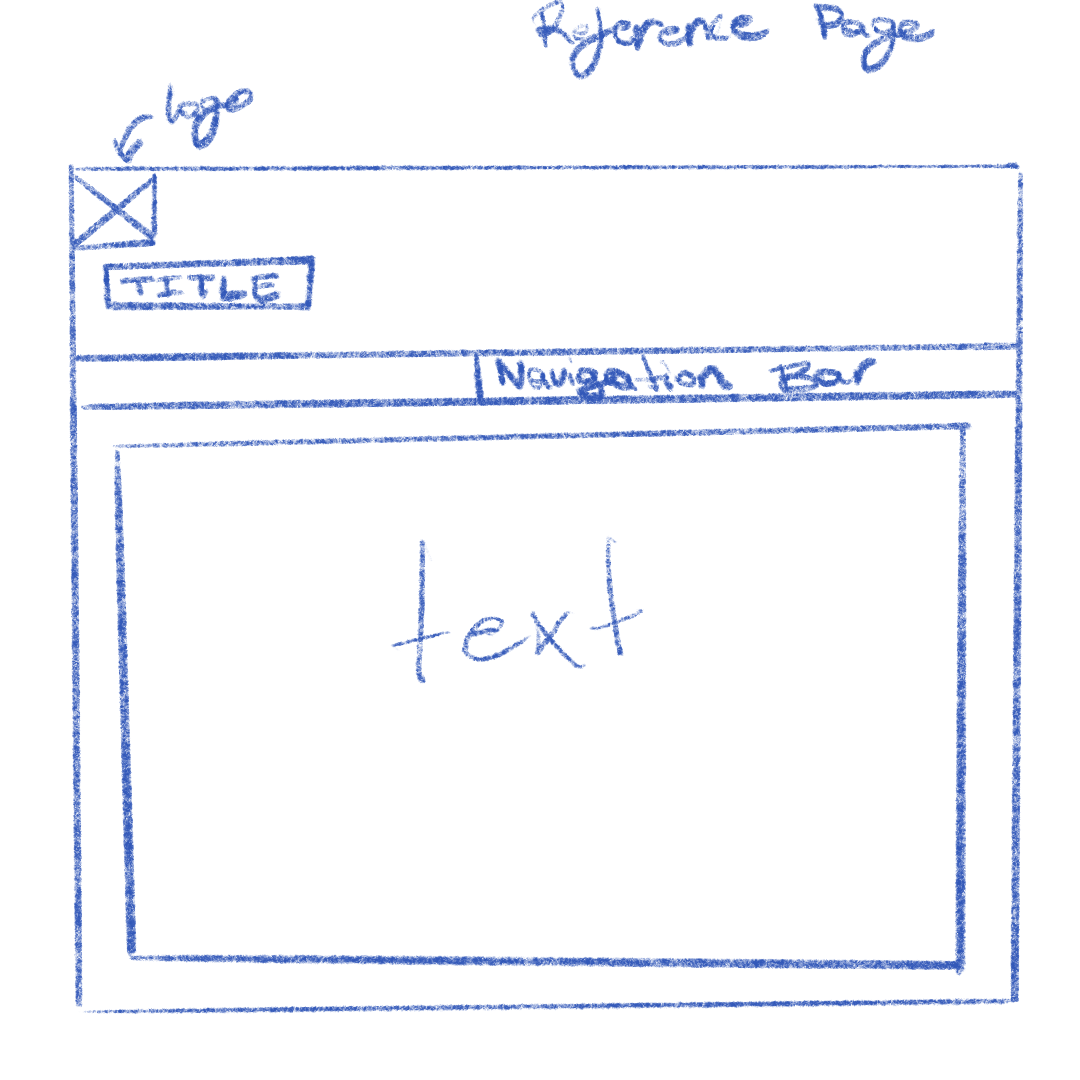
Reference page
|
Theme
I wanted to focus on a simple and clean theme since that is what best represents me. I went with a column based layout where all the content is compartmentalized and an off-white palette for that variation in colour.
I used a small amount of graphics as possible so that the page was not crowded. Only graphics relevant to the content was chosen.
I feel like my website can be appreciated by anyone willing to get a better understanding of who I am.
Features
- The website uses a horizontal navigation bar that allows the user to move from one page to the next easily.
- You can send an email to me by clicking on my photo on the index page.
- Images will be used to provide visuals and contrast the text content.
Hosting Link
Hosting Link
|
